Mobile Checkout Sales Killers: Why Your Customers Are Vanishing at the Finish Line
In the high-speed digital economy of Mumbai, your customers aren't just "online"—they are mobile. They are browsing your Shopify store while commuting on the Metro, grabbing a coffee in Bandra, or during a quick break at the office.
But here is the painful reality for many e-commerce brands: Traffic does not equal transactions. You might see thousands of visitors hitting your product pages from Instagram, yet your conversion rate remains stubbornly low. The culprit? Mobile Checkout Friction. If your checkout process feels like an obstacle course, your customers will simply close the tab.
At Prateeksha, we specialize in identifying these "Sales Killers." Here is a deep dive into the friction points that are murdering your mobile revenue and how to fix them.
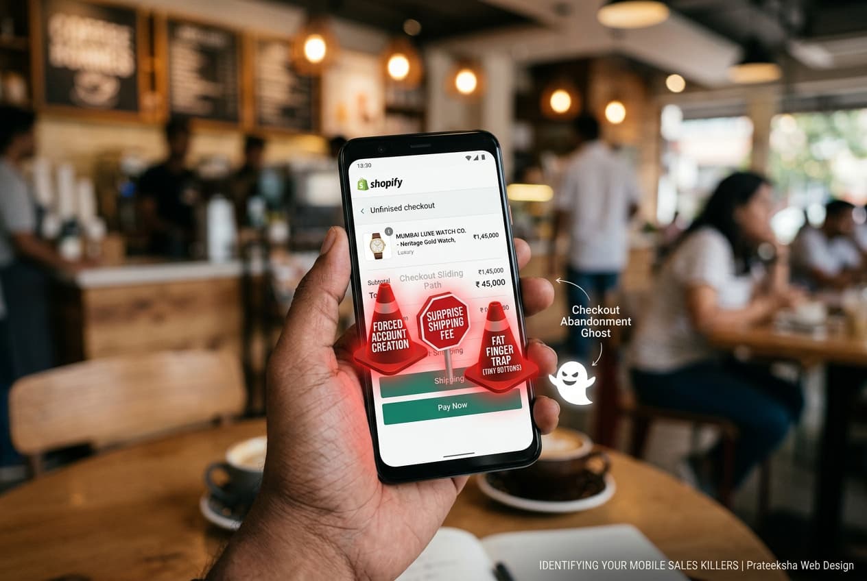
1. The "Surprise" Shipping Costs
Nothing kills a mobile sale faster than a "sticker shock" at the final step. When a user spends five minutes navigating your site on a small screen, only to find an additional ₹200 shipping fee at the very end, they feel deceived. On mobile, this frustration is amplified because the user has worked harder to get to that stage.
The Fix: Be transparent. Display shipping costs (or "Free Shipping" thresholds) on the product page or via a top-bar announcement. At Prateeksha, we recommend using Shopify Scripts or Functions to show real-time shipping estimates early in the cart drawer.
2. Forced Account Creation
Imagine being in a hurry and being told you must create an account, verify an email, and set a password just to buy a t-shirt. For a mobile user, this is a dealbreaker.
The Fix: Enable Guest Checkout. You can always encourage account creation after the purchase is complete on the "Thank You" page. Keep the path to the "Pay" button as straight as possible.
3. The "Fat Finger" Navigation Trap
Mobile screens are small; human thumbs are not. If your form fields are too close together, or if your "Place Order" button is tiny and buried at the bottom of a long scroll, you are creating physical friction. If a user accidentally clicks "Cancel" instead of "Continue" because the buttons are cramped, they rarely try a second time.
The Fix: Design for the "Thumb Zone." Ensure all interactive elements are at least 44x44 pixels. Use plenty of white space between form fields to prevent accidental clicks.
4. Lack of Localized Mobile Payments
In the Indian market, credit cards are no longer the primary way people pay. If your mobile checkout doesn't prominently feature UPI (GPay, PhonePe, Paytm) or one-click checkout options, you are losing more than 50% of your potential sales.
The Fix: Integrate accelerated payment methods like Shop Pay, Apple Pay, and localized UPI gateways. Reducing the checkout to a single tap or a face-ID scan is the ultimate conversion booster.
5. Intrusive Pop-ups and Overlays
We see it all the time: a mobile user reaches the checkout page, and suddenly a "10% Off" pop-up blocks the entire screen. On mobile, these overlays are often difficult to close, and the "X" button is frequently hidden or too small to hit.
The Fix: Kill the pop-ups on the checkout page. Use subtle, non-intrusive "trust badges" or "limited time" banners that don't interrupt the actual transaction flow.
6. The Endless Form (Data Fatigue)
Standard checkouts often ask for too much information. Do you really need their middle name? Do you need their landline number? Every extra field is another chance for the user to get distracted or annoyed.
The Fix: Use Address Autocomplete (via Google Maps API). This allows a user to type three letters of their Mumbai address and have the rest—city, state, and pin code—filled in automatically. It reduces typing by up to 60%.
7. Slow Page Load Times (The Silent Killer)
If your checkout takes more than 3 seconds to load on a 4G connection, you’ve already lost. Mobile users equate slow loading with a lack of security. If the "Processing" spinner spins for too long, they will fear a double charge and bail.
The Fix: This is where Shopify Plus or a Headless Hydrogen build shines. By optimizing your technical stack, we ensure that the transition from cart to "Order Confirmed" is instantaneous.
Conclusion: Is Your Checkout Helping or Hurting?
Your mobile checkout should be a slide, not a staircase. Every element that doesn't actively help the user complete the purchase is a potential sales killer.
At Prateeksha Web Design, we don't just build pretty websites; we build high-converting machines. We perform deep-dive UX audits to find exactly where your mobile users are dropping off and implement the technical fixes to bring them back.
Don't let friction steal your profits. Contact Prateeksha.in today for a Mobile UX Audit and turn your "abandoned carts" into "completed orders."
5 More Shopify Mobile Checkout Fixes That Directly Lift Conversion
- Switch to Shopify's one-page checkout. Shopify rolled out its one-page checkout for all plans. Multi-step checkouts add psychological friction — each new page feels like a new commitment decision. One-page checkout consolidates contact, shipping, and payment into a single scroll, which typically reduces checkout abandonment by 15–25% on mobile. If your Shopify store is still running the three-page checkout flow, this is the highest-leverage change you can make today with zero development cost.
- Make Shop Pay the most prominent payment option. Shop Pay has the highest checkout conversion rate of any accelerated checkout method on Shopify — approximately 1.72× the conversion rate of guest checkout. On mobile, it eliminates address entry entirely for returning users. Position the Shop Pay button above the standard credit card form. The visual hierarchy of your payment section should lead with the fastest path to purchase.
- Enable address autocomplete via Google Maps API. Address entry is the single highest-friction form interaction on mobile. Shopify natively supports address autocomplete, but it must be enabled in your theme settings and confirmed to be working with your theme version. For markets like Mumbai where addresses include building names, floor numbers, and landmark references, autocomplete reduces both form abandonment and address-related fulfilment errors.
- Place your primary CTA within thumb reach. On screens 375–430px wide, the comfortable thumb zone is the bottom 40% of the screen. If your "Continue to payment" button sits above the fold after a long address form, mobile users have to stretch or shift grip to reach it. Test this physically on a real device, not just in Chrome DevTools mobile emulation.
- Position trust badges at the exact moment of hesitation. Most Shopify themes place trust badges in the footer, where no one reads them. The moment of maximum purchase hesitation on mobile is immediately before the final payment button. Place a compact trust bar — SSL lock, return policy, payment logos — directly above the "Place order" button.
Frequently Asked Questions: Mobile Checkout Optimisation
How do I find out which checkout step is causing the most drop-off?
The most reliable method is Shopify Analytics → Checkout funnel report, which shows the percentage of sessions that reach each checkout step and the drop-off rate between steps. Pair this with a session recording tool (Microsoft Clarity is free and integrates cleanly with Shopify) to watch real mobile sessions. Look for rage taps, form abandonment moments, and scroll depth on the checkout page.
Is it worth building a custom checkout, or should I stick with the native Shopify checkout?
For most Shopify and Shopify Advanced stores, the native checkout optimised with the fixes above will outperform a heavily customised one. Custom checkout UI is only worth pursuing on Shopify Plus, where Checkout Extensibility allows you to add custom components. If you are not on Shopify Plus, fix the native checkout first — the performance and compliance risks of third-party checkout solutions typically outweigh the conversion gains.
Mobile Checkout Optimisation Checklist for Shopify Stores
Use this checklist to audit your current Shopify checkout experience on mobile — each item maps to a measurable friction point that costs you completed orders.
- Shop Pay enabled: Activate Shop Pay so returning Shopify customers can complete checkout in two taps without re-entering card or address details.
- Apple Pay and Google Pay configured: Set up both wallet payment methods in your Shopify Payments settings so iOS and Android users see a native one-touch payment option at the top of the payment step.
- Address autocomplete on: Confirm that Shopify's built-in Google address autocomplete is active — it eliminates the single biggest form-filling bottleneck on a mobile keyboard.
- Checkout page speed under 2 seconds: Test your checkout load time with a real mobile device on a 4G connection; anything above 2 seconds measurably increases abandonment before the payment step is reached.
- No redirect-based payment gateways: Replace any gateway that pushes customers to an external payment page — every redirect adds latency and breaks the native checkout trust signal.
- Autofill attributes on all form fields: Ensure every checkout input has the correct
autocompleteattribute (e.g.given-name,postal-code,cc-number) so the browser can populate fields without the customer typing. - Sticky CTA button on mobile: The primary action button — "Continue to shipping", "Pay now" — should remain visible as the customer scrolls, eliminating the need to hunt for the next step.
- Trust badges above the fold on checkout: Display security seals, accepted payment icons, and a returns guarantee within the visible viewport on mobile before the customer scrolls to the order summary.
- Cart abandonment email set up via Klaviyo: Configure a Klaviyo abandoned-checkout flow triggered within 30 minutes of drop-off — it is the lowest-effort recovery mechanism available and should be live before any other CRO work begins.
- Checkout progress indicator shown: A simple step indicator (1 / 2 / 3) reduces the perceived effort of completing checkout and lowers mid-funnel drop-off on mobile where context is easily lost.
- Error messages shown inline, not page-level: Validation errors must appear immediately beneath the relevant field — a generic page-level error forces customers to scroll and guess which input caused the failure.
- Phone number field typed as
tel: Settype="tel"on the phone input so mobile browsers launch the numeric keypad automatically rather than the full QWERTY keyboard. - Postcode lookup enabled: Integrate a postcode-to-address lookup service so customers can enter their postcode and select their address from a list rather than typing a full street address on a small screen.
- One-page or accelerated checkout flow tested: If you are on Shopify Plus, A/B test a condensed single-page checkout layout against the default three-step flow — for high-AOV stores the reduction in perceived steps often outweighs the increase in page weight.
Brands that implement all 14 items consistently report a 10–20% improvement in mobile checkout completion rate within 30 days of going live. If you want a hands-on audit of where your store is losing mobile revenue right now, explore our Shopify CRO optimisation service — we review your live checkout, prioritise fixes by revenue impact, and implement them inside Checkout Extensibility without touching your theme.