Figma to Shopify Pixel Perfection: Bridging the Gap Between Vision and Reality
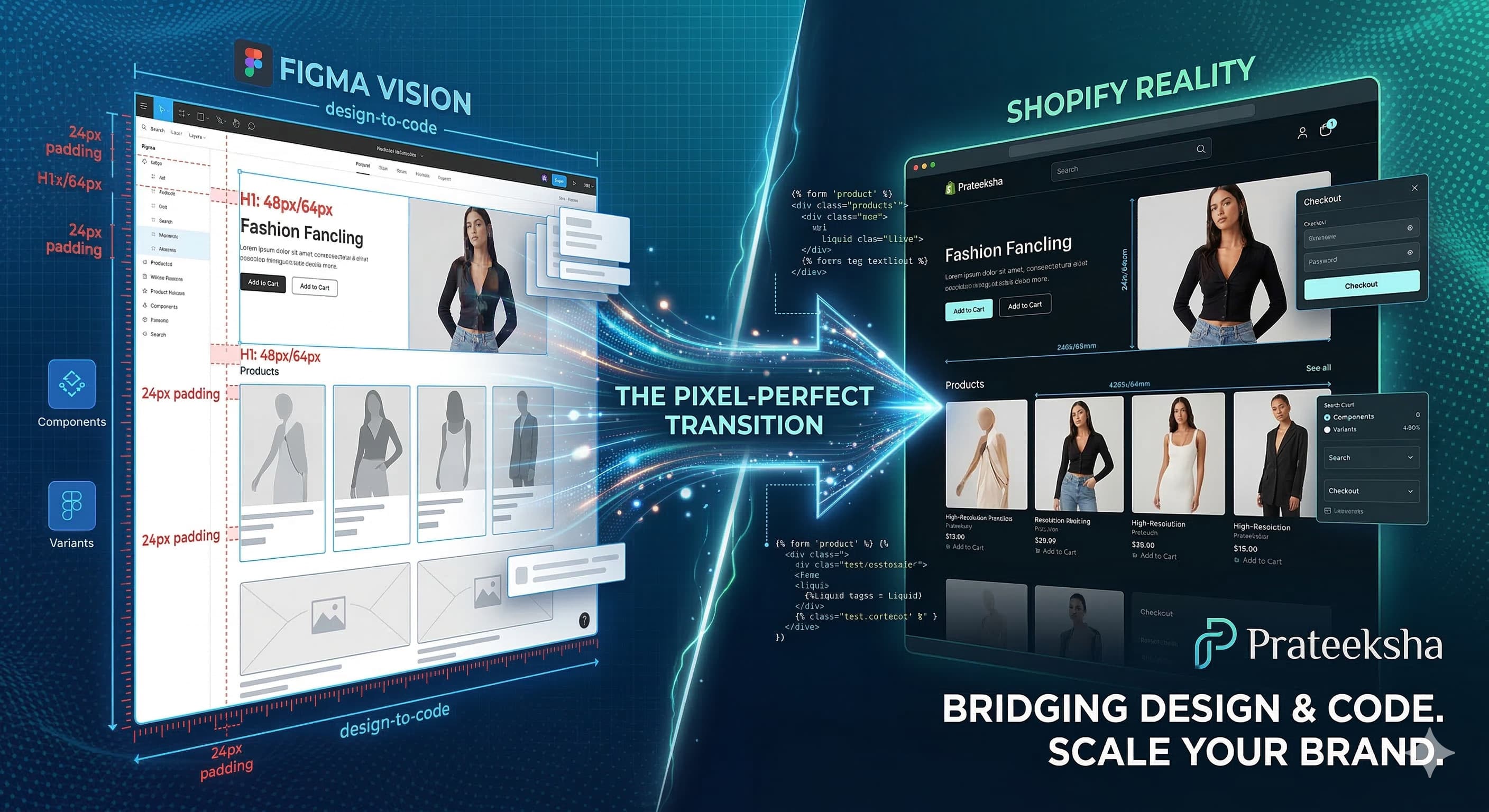
You’ve spent weeks, perhaps months, meticulously crafting the perfect user interface for your new e-commerce store in Figma. Every drop shadow is defined, every margin is precise to the pixel, and the responsive breakpoints are flawlessly mapped out. It’s not just a design; it’s a direct reflection of your brand’s identity.
Then comes the conversion. The moment when your beautiful static vectors need to be translated into the living, breathing language of HTML, CSS, and Shopify’s Liquid templating engine.
All too often, this is where the magic fades. What looked sleek in Figma becomes clunky on screen. Alignment issues creep in, and the mobile experience feels like an afterthought. At , we believe that your store should be a flawless, high-performing replica of your design vision.
What is "Pixel Perfect" (and Why Should You Care)?
In the era of responsive design, "pixel perfect" means Fidelity to Design Intent. It means that the visual hierarchy, typographic scale, and spacing relationships designed in Figma are preserved across all devices, from a 30-inch 4K monitor to an iPhone SE.
Why is this essential for e-commerce?
Brand Trust: Professional, consistent design signals legitimacy.
Cognitive Load: Intuitive design depends on predictability. Misaligned elements create subtle friction for the user.
Conversion Rate Optimization (CRO): A flawless UI/UX keeps users engaged and reduces friction in the purchase funnel.
The 3 Pillars of Figma-to-Shopify Pixel Perfection
To achieve a true design-to-code match, your development process must excel in three core areas:
1. Advanced Technical Expertise
This goes beyond basic templates. Achieving high fidelity requires mastery of:
CSS Flexbox and Grid: Essential for creating dynamic layouts that adapt without breaking the visual hierarchy.
Relative Units (rem/em): Using these instead of fixed pixels ensures your site scales proportionally across different browser settings.
Custom Liquid Development: At , we avoid bloated pre-made themes. We build custom Liquid structures to ensure every element renders exactly as designed.
2. Process Discipline & Design Handoff
The biggest cause of fidelity loss occurs during the handoff. A disciplined process bridges this gap:
Design Systems: Building with Figma’s Components and Variants allows developers to create a reusable theme library, guaranteeing consistency.
Explicit Spacing Scales: Using a consistent base (like an 8px grid) removes the guesswork for developers.
Dev Mode Integration: Utilizing Figma’s Dev Mode provides a single source of truth for CSS variables, colors, and assets.
3. Performance-First Mindset
A pixel-perfect site that takes 10 seconds to load is a failed site. True quality integrates beauty with speed.
Image Optimization: Utilizing WebP or AVIF formats and implementing
srcsetensures images look crisp without slowing down the site.Code Minification: Removing unnecessary code improves initial load times and helps you pass Google’s Core Web Vitals.
Lean Architecture: Custom builds ensure only the necessary scripts are loaded, keeping your store fast and agile.
Why Choose Prateeksha for Your Shopify Build?
Achieving true Figma to Shopify pixel perfection is a specialized technical discipline. It requires a team that speaks both languages—the visual language of design and the logical language of code.
As a dedicated Shopify Web Design Agency in Mumbai, specializes in translating complex visual identities into high-performing e-commerce realities. We don't just "build websites"; we engineer high-converting digital storefronts that stay true to your brand's aesthetic.
Our Promise:
Zero-Guesswork Handoffs: We work with your design files to ensure every detail is accounted for.
Performance as a Standard: High fidelity meets lightning-fast speeds.
Scalable Solutions: Themes built to grow with your brand.
If you have a Figma design ready to launch, don't settle for "close enough." Partner with the experts who deliver pixel-perfect precision.
today to discuss how we can turn your Figma vision into a flawless Shopify store.
Where Figma Designs Break Down in a Real Shopify Build
Even a technically skilled Shopify developer will introduce gaps if the handoff process is vague. These are the most common places where a pixel-perfect Figma design loses fidelity once it hits a live Shopify theme:
- Custom fonts not loading correctly. Figma previews use locally installed fonts. In Shopify, every typeface must be hosted via Shopify CDN (using
font_faceLiquid tags) or loaded from Google Fonts. Variable fonts, unusual weights, and proprietary typefaces regularly break in production because the developer substituted a system fallback. Always confirm that every font family, weight, and style used in the Figma file is explicitly listed in the handoff document with its exact loading source. - Hover states and micro-interactions missing entirely. Figma Prototype mode shows hover states, transitions, and interactive overlays — but none of that is automatically translatable. Developers need frame-by-frame specifications: what changes (colour, shadow, scale, underline), what triggers the change, and how long the transition takes. If this is not documented, hover states are typically omitted or guessed.
- Responsive breakpoints not defined. Shopify's default Dawn theme uses three breakpoints (mobile <750px, tablet 750–989px, desktop ≥990px). A Figma file that only shows a desktop and a single mobile frame leaves the mid-range layout open to interpretation. Specify how columns collapse, how font sizes shift, and whether any components are hidden or reordered below 768px.
- Spacing inconsistencies at component boundaries. Section padding and inter-component margins that look correct in Figma isolate often clash when sections are stacked in the Shopify section editor. Declare spacing tokens (e.g., section-padding-top: 80px desktop / 40px mobile) explicitly rather than leaving developers to eyeball pixel values from a screenshot.
- Colour mode and opacity discrepancies. Figma's colour picker uses opacity in layer modes that do not translate 1:1 to CSS. Always export colours as final HEX or RGBA values in the handoff.
How to Write a Proper Design Handoff Document
A design handoff document is not a link to the Figma file. It is a structured specification that a developer can action without booking a call. For Shopify projects, a thorough handoff covers:
- Typography table: Every font family, weight, size per breakpoint, line height, letter spacing, and CSS variable name.
- Colour system: All brand colours with HEX, RGB, and their intended CSS variable names.
- Component inventory: Every interactive component listed with its default, hover, active, focus, and disabled states.
- Shopify section map: Which Figma sections correspond to which Shopify sections or blocks. If a section is custom, flag it clearly.
- Animation specifications: Duration (ms), easing curve, trigger, and whether the animation should respect
prefers-reduced-motion. - Asset export list: Every image, icon, and SVG with its format, intended dimensions, and alt text.
Sharing this document before development starts reduces revision cycles by at least 40% on most Shopify projects. It removes the grey area where developers make aesthetic decisions they are not qualified to make.
5-Point QA Checklist Before a Figma-to-Shopify Build Goes Live
- Side-by-side visual diff: Open the Figma desktop frame and the live Shopify page at the same viewport. Compare spacing, typography sizes, and colour values visually.
- Hover and interactive state audit: Tab through every interactive element on both desktop and mobile. Confirm that each state matches the Figma specification.
- Cross-breakpoint check: Test at 375px, 768px, 1024px, 1280px, and 1440px minimum. Specifically look for text overflow, broken grid columns, and unswapped mobile images.
- Font rendering audit: Open Chrome DevTools → Elements → Computed, and verify that every text element is rendering the intended font family and weight.
- Performance baseline: Run Lighthouse on the homepage, a collection page, and a product page. Target LCP under 2.5 seconds and CLS under 0.1.
Frequently Asked Questions: Figma to Shopify
Can I hand off a Figma file directly to a Shopify developer and expect pixel-perfect output?
Not reliably. A Figma file is a design artefact, not a development specification. Without a companion handoff document that defines typography tokens, colour variables, interaction states, and breakpoint behaviour, even a skilled developer will make interpretation calls that drift from the original design. The handoff document is what converts a Figma file into an actionable build brief.
How long does a Figma-to-Shopify build typically take?
A standard 8–12 section Shopify storefront build from a complete Figma file takes 3–5 weeks. Timeline is most affected by the completeness of the Figma file, the number of custom Liquid sections required, third-party app integrations, and the number of revision cycles in QA. Projects with a thorough handoff document consistently finish faster and with fewer post-launch issues.
Common Figma-to-Shopify Mistakes That Delay Launch
Even well-structured Figma files can create serious delays once they reach a Shopify developer. Most of these issues are avoidable — they stem from designers working in isolation without understanding how Shopify renders components. Here are the five mistakes we see most often at Prateeksha, and how to prevent them.
Fonts Not Embedded or Licensed for Web
Figma previews fonts beautifully because it uses its own renderer. The moment a developer tries to implement that same typeface in a Shopify theme, they need a web-licensed font file or a Google Fonts / Adobe Fonts URL. If the font is a purchased desktop licence only, it cannot legally (or technically) be embedded on a public storefront. Clients have lost weeks waiting for licensing approvals or switching to a substitute mid-build. Confirm web licensing before the design is approved, and include the exact CDN embed snippet in your handoff doc.
Missing Mobile States for Critical Components
Designing a desktop hero at 1440px and a mobile frame at 375px is not the same as designing all components at both breakpoints. Navigation mega-menus, announcement bars, product carousels, and sticky add-to-cart bars each behave differently on mobile. Developers who receive only desktop designs must guess — and guessing costs revision cycles. Every interactive component in the file needs a corresponding mobile frame before handoff is considered complete.
Liquid Section Limitations Not Considered
Shopify's Liquid section architecture places real constraints on layouts. Sections render sequentially; CSS grid layouts that overlap sections or use position:sticky across section boundaries often break in practice. Designs that assume arbitrary z-index stacking or elements that bleed across two sections will require significant rework. Before finalising layouts, have your developer review any component that spans a content boundary or relies on overlapping layers.
No Loading or Error States Designed
A product page is not just its default state. Add-to-cart buttons have loading spinners and sold-out variants. Collection filters show zero-results states. Search returns empty queries. If these states are not in the Figma file, developers either skip them entirely or build something inconsistent with the design language. Loading and error states should be designed alongside the primary UI — not treated as an afterthought.
Assets Not Optimised Before Export
A hero image exported at 4MB from Figma will not pass a Core Web Vitals audit. Shopify's CDN helps, but it does not compress or reformat files automatically unless you are using the image_url filter with explicit width parameters. PNGs with transparent backgrounds should be WebP where transparency is not required. SVGs should be run through SVGO before upload. Include target file sizes in your asset export standards — hero images under 200KB, icons under 10KB — so there is no ambiguity at handoff.
Each of these mistakes is straightforward to prevent once your team has a shared checklist. The questions below address the points clients most commonly raise once they understand what a thorough handoff actually involves.