How I Plan a Custom Shopify Theme Around the Buying Journey
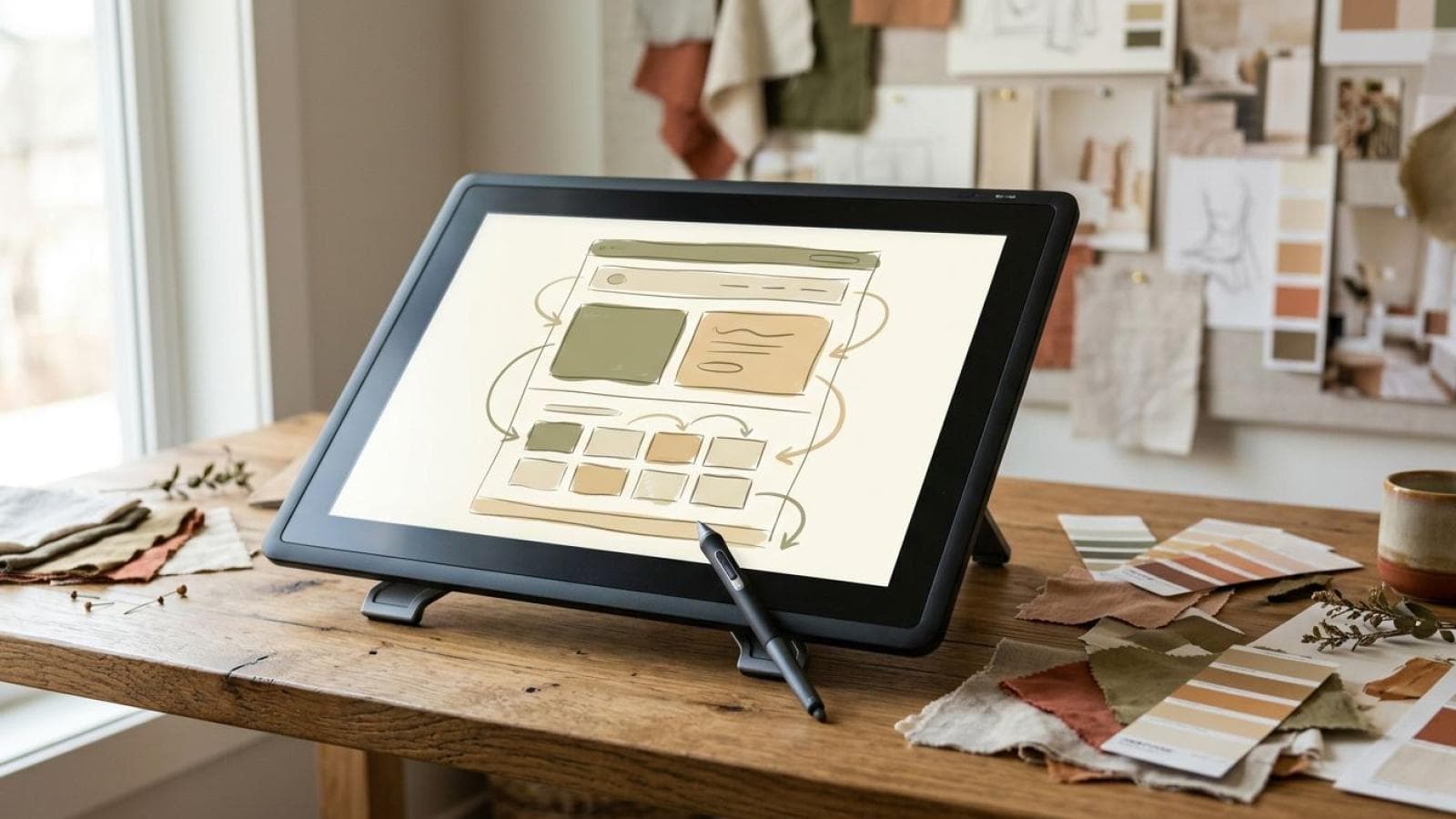
Custom Shopify theme development starts, for me, with the buying journey rather than the visual design. Before I open a design tool, I map exactly how a customer moves from landing on the store to completing checkout — what they need to see at each stage, and what decision they're making at each step. The theme is built around that map, not the other way around.
Custom Shopify theme development starts, for me, with the buying journey rather than the visual design. Before I open a design tool, I map exactly how a customer moves from landing on the store to completing checkout — what they need to see at each stage, and what decision they're making at each step. The theme is built around that map, not the other way around.
This is different from picking a theme based on looks or comparing pricing tiers. A theme can be gorgeous and still slow customers down at the exact moments that matter most for conversion. Here's how I plan a custom theme around the actual path a buyer takes, stage by stage.
Starting with Brand and Catalogue, Not Templates
Starting with brand and catalogue means I look at what you actually sell and how you want to be perceived before I think about any visual pattern. A catalogue of a few hero products needs a completely different homepage and navigation structure than a catalogue of hundreds of SKUs across multiple categories — treating them the same is where a lot of off-the-shelf theme customisation goes wrong.
I also look at brand tone here: whether the store needs to feel premium and editorial, fast and utilitarian, or warm and approachable changes typography, spacing, and imagery choices throughout the build, not just the homepage hero section.
Catalogue depth changes the homepage itself. A store with a handful of hero products can afford a homepage built almost entirely around storytelling and imagery, because there's little risk of overwhelming a visitor with choice. A store with hundreds of SKUs across a dozen categories needs the homepage to work harder as a routing mechanism — clear category entry points, a visible search bar, and curated collections that help a visitor narrow down quickly rather than scroll through everything.
Navigation Designed Around How Customers Actually Search
Navigation designed around how customers actually search means the menu structure follows the mental categories your customers already use to think about your products, not your internal inventory organisation. A customer looking for "gifts under ₹2,000" thinks in a completely different structure than your warehouse team thinks in SKUs and supplier codes.
I build the navigation and collection structure directly from real search and filter behaviour where that data exists — Shopify's own analytics on collection and search usage is the first place I look, because it shows what customers are actually trying to find, not what a wireframe assumes they want.
For a new store without historical data, I work from the closest available proxy: competitor navigation patterns in the same category, customer service enquiries if the brand has an existing sales channel, or a short round of user testing with a clickable prototype before committing to the final structure. Guessing at navigation without any of these inputs is how stores end up with a beautifully designed menu that customers quietly route around using search instead.
- Review actual on-site search terms and top-clicked collections from store analytics.
- Group products into customer-facing categories based on how people search, not internal SKU logic.
- Design the primary navigation around the three to five categories customers use most.
- Push long-tail or niche categories into secondary navigation or filters, not the main menu.
 Navigation is built from real search behaviour, not internal catalogue structure.
Product Discovery and Collection Pages
Product discovery on a collection page needs to answer one question fast: does this category have what I'm looking for? I design collection pages to surface the filters and sort options that matter for that specific catalogue — size and colour for fashion, compatibility and specification for electronics, dietary tags for food — rather than shipping the same generic filter set across every theme.
Image-to-text ratio matters here too. A catalogue where products look visually similar (say, several shades of the same garment) needs stronger supporting text and filter labels than a catalogue where products are visually distinct at a glance.
Sort order deserves the same deliberate attention as filters. A default sort of "best selling" works well for an established catalogue with real sales history, but it actively hides new arrivals and can make a young store's collection pages feel stagnant. I set the default sort based on what the collection actually needs to communicate — newest-first for a fashion drop, price-ascending for a value-conscious category, best-selling for an established bestseller-driven range — rather than leaving Shopify's generic default in place across every collection.
Product Page Decisions That Support the Purchase Decision
Product page decisions should be built around what a customer needs to know before they'll commit to buying, not around what looks good in a design mockup. I decide the order of information — images, price, variant selection, description, trust signals, reviews — based on the actual questions customers ask about that specific product category, which I gather from existing customer service queries, product reviews, and return reasons where that data is available.
For a considered purchase (furniture, electronics, higher-priced fashion), I give more visual and content weight to specification details and social proof. For an impulse or lower-consideration purchase, I keep the path from product image to add-to-cart as short as possible, because friction matters more than information density in that context.
Variant selection design follows the same logic. A product with two or three simple variants (a single size chart, a colour swatch row) can use inline selectors right beside the price. A product with genuinely complex configuration — multiple dependent options, or combinations where not every pairing is in stock — needs a more deliberate selection flow that guides the customer toward a valid combination, rather than letting them discover an out-of-stock pairing only after they've already committed to a choice.
 A considered-purchase product page and an impulse-purchase product page are structured differently on purpose.
Designing Toward Checkout Intent
Designing toward checkout intent means every page between product discovery and checkout should reduce hesitation, not just look polished. I pay close attention to the cart experience specifically — a slide-over cart that shows exactly what's been added, with clear next steps, keeps momentum toward checkout in a way that a confusing or hidden cart doesn't.
I also make sure trust signals (shipping timelines, return policy, secure payment badges) appear at the moments a customer is actually deciding whether to proceed, not buried on a separate policy page nobody visits before checkout. If your store already has a documented approach to checkout optimisation, I build the theme to support that flow directly rather than working against it.
The cart page and slide-over cart deserve explicit design attention rather than a default theme component left untouched. I make sure quantity changes, variant details, and remove actions are all immediately clear without a page reload, and that the path from "item added" back to "continue shopping or check out" is obvious. A customer who has to think about how the cart works is a customer whose attention has moved away from the products they wanted to buy.
Mobile-First, Because Most Buying Journeys Start There
Mobile-first means I design and test every stage of the buying journey on a mobile viewport before I check the desktop layout, not the reverse. For most Shopify stores, the majority of traffic and a large share of purchases happen on mobile, so a theme that's merely "responsive" on a desktop-first design misses interaction patterns — thumb reach for navigation, tap target sizing on filters, load performance on slower connections — that a mobile-first build gets right from the start.
This shows up in concrete decisions, not just a general principle. Navigation collapses into a pattern that's genuinely easy to operate one-handed, not just a shrunk-down desktop menu. Filters on collection pages open as a bottom sheet within thumb reach rather than a sidebar that requires scrolling up. Product images are sized and compressed for the connection speeds your actual customers are likely to have, since a beautiful desktop-resolution image that takes four seconds to load on mobile is actively working against the buying journey it's meant to support.
How This Differs from Choosing an Off-the-Shelf Theme
An off-the-shelf theme — even a well-built one like Dawn — is designed to work reasonably well for a broad range of stores, which means it can't be optimised specifically for your catalogue's buying journey. If you're still deciding between customising an existing theme and a full custom build, I've laid out that trade-off in more detail in custom theme development versus Dawn. The buying-journey planning process described here applies to a custom build, where every stage can be shaped around your specific customers rather than a generic template's assumptions.
That said, buying-journey thinking isn't exclusive to custom builds — it's just harder to apply fully within an existing theme's structure. A store customising Dawn can still audit its own navigation against real search behaviour, adjust product page information order, and rework filter logic for its specific catalogue. The ceiling on how far that goes is set by the theme's underlying architecture, which is exactly where a custom build starts to earn its cost: once the buying journey demands a structure the template wasn't built to support.
Frequently Asked Questions
Do you design the visual style first or the buying journey first?
The buying journey first. I map how customers move from landing to checkout, and what they need to see at each stage, before any visual design work begins. Visual style is applied within that structure, not as a separate first step.
How do you decide what goes in the main navigation?
I use real search and click behaviour from store analytics to find the three to five categories customers use most, and build the primary navigation around those — internal SKU or supplier categories rarely map cleanly onto how customers actually search.
Does a custom theme need to be different for mobile and desktop?
The buying journey is planned mobile-first, since most traffic and purchases happen there for most stores, then adapted for desktop. This is different from designing desktop-first and adding responsive breakpoints afterward.
What's the difference between this approach and just customising an existing theme?
Customising an existing theme starts from a template's existing structure and adjusts it; planning around the buying journey starts from your specific catalogue and customers and builds the structure from scratch. Both are valid depending on budget and how specific your requirements are.
How does product page layout change based on what's being sold?
Considered purchases get more specification detail and social proof higher on the page; impulse or lower-consideration purchases get a shorter, friction-free path from product image to add-to-cart. The right layout depends on how your specific customers actually decide to buy.
Tell me about your catalogue and how customers currently move through your store, and I'll map out a custom theme plan built around your actual buying journey.
See how I build custom Shopify themesReady to plan your theme around how customers really buy?
Book a scoping call