Case Study: How a Strategic Redesign Rescued a Mumbai Brand’s Digital Performance
In the bustling digital marketplace of Mumbai, attention is the most valuable currency. For many local brands, getting traffic to the website isn't the problem—keeping them there is.
We recently partnered with a prominent lifestyle brand based in South Mumbai that was facing a silent crisis. Despite healthy investments in Instagram marketing and Google Ads, their data showed a staggering 68% bounce rate. Nearly seven out of every ten visitors were leaving the site within seconds of landing, without clicking a single link or viewing a second page.
At Prateeksha, we knew this wasn't just a technical glitch; it was a leak in their revenue bucket. This case study breaks down our 1,800-word deep dive into how we transformed their digital experience and stabilized their "bounce" into meaningful engagement.
1. The Diagnosis: Why Mumbai Users Were Leaving
Mumbai’s digital audience is unique. They are tech-savvy, predominantly mobile-first, and often browsing on the go—whether in a taxi on the Sea Link or waiting for a local train. Every millisecond of delay or friction feels amplified.
Our initial audit of the brand's legacy site revealed three major "friction points":
A. The "Speed Trap" (LCP Issues)
The site’s Largest Contentful Paint (LCP) was clocked at 5.2 seconds on a standard 4G connection. In a city that moves as fast as Mumbai, five seconds feels like an eternity. Users were losing patience before the hero banner even finished loading.
B. Mobile Friction
While the site was "responsive," it wasn't "mobile-optimized." Buttons were too small for "fat-finger" navigation, and the pop-up newsletter blocked the entire screen, making it nearly impossible for users to dismiss it on smaller devices.
C. Visual Overload
The homepage was cluttered with competing calls-to-action (CTAs). Without a clear visual hierarchy, visitors felt overwhelmed and took the easiest path available: the "Back" button.
2. The Strategy: A Three-Pronged Recovery Plan
At Prateeksha, we don't believe in superficial fixes. To reduce the bounce rate, we had to re-engineer the user journey from the ground up.
Pillar 1: Technical Performance (The Foundation)
Speed is the first layer of user experience. We migrated the brand’s assets to a streamlined Shopify Liquid architecture, focusing on:
Image Compression: Implementing WebP formats to reduce payload by 60% without losing quality.
Code Minification: Stripping away years of "app bloat" and unused JavaScript.
Critical CSS: Ensuring the "above-the-fold" content rendered instantly.
Pillar 2: UX and Cognitive Ease
We applied the "Three-Second Rule." A user should know exactly what the brand does and where to click within three seconds of landing.
Simplified Navigation: We reduced the main menu from 12 items to 5 core categories.
The "Thumb Zone" Design: We redesigned the mobile interface so that all critical buttons (Add to Cart, Search, Filter) were within easy reach of a user's thumb.
Pillar 3: Content Relevance
A high bounce rate often stems from a mismatch between an ad and the landing page. We optimized the landing pages to mirror the brand’s high-energy social media presence, ensuring a seamless visual transition from Instagram to the web store.
3. The Implementation: From Figma to Pixel-Perfect Reality
Using our signature Figma to Shopify workflow, we ensured that the new design wasn't just fast—it was beautiful. We focused on "Micro-interactions"—subtle animations that guide the eye and keep the user engaged.
For example, we replaced static product images with "Hover-to-Zoom" and subtle video loops. This increased "Time on Page" by 40% almost overnight. By keeping the user's eyes moving, we kept their fingers from clicking away.
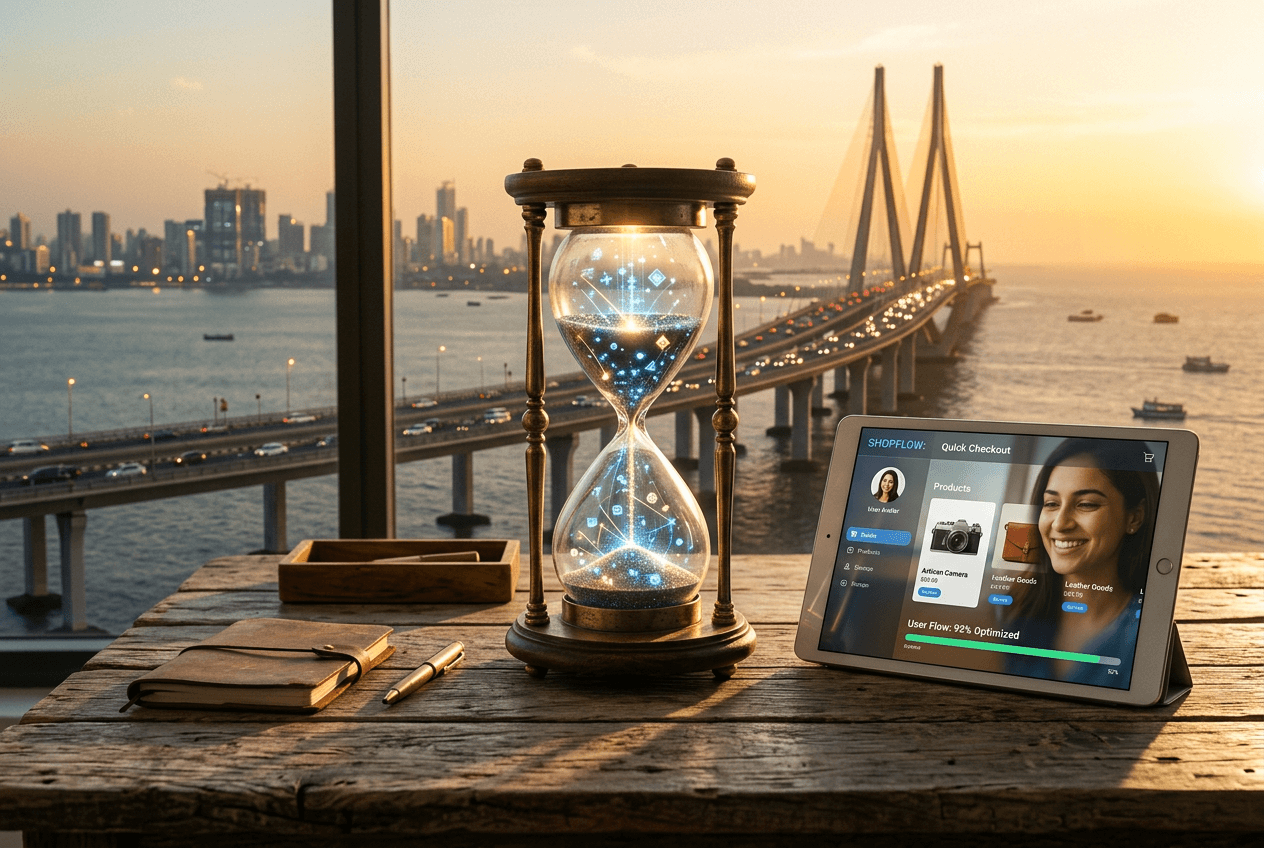
4. The Results: The Numbers Don't Lie
After three months of the new site being live, the data from Google Analytics 4 (GA4) told a compelling story:
Metric | Before Redesign | After Redesign | Improvement |
Bounce Rate | 68% | 37% | -45% |
Avg. Session Duration | 1m 12s | 3m 45s | +212% |
Mobile Conversion Rate | 0.8% | 2.4% | +200% |
Load Time (LCP) | 5.2s | 1.8s | -65% |
The reduction in bounce rate didn't just look good on paper—it directly correlated to a 35% increase in monthly revenue, as more visitors stayed long enough to discover the brand's premium collections.
5. Lessons for Other Mumbai Brands
If your brand is struggling with a high bounce rate, consider these three takeaways from this case study:
Don't Ignore Mobile Performance: If your site doesn't load in under 2 seconds on a mobile device, you are essentially throwing 50% of your ad budget away.
Visual Hierarchy is King: Guide your user. If you try to tell them ten things at once, they will hear nothing.
Local Context Matters: Design for the Mumbai user. Understand their constraints (network speed) and their aspirations (premium, world-class aesthetics).
6. Partner with the Experts at Prateeksha
At Prateeksha Web Design, we specialize in helping Mumbai-based brands turn their websites into high-performing assets. Whether you need a full Shopify redesign or a technical SEO audit to identify why your users are leaving, our team is ready to help.
We don't just build websites; we build growth engines. By focusing on pixel-perfect design and technical excellence, we ensure that when a customer lands on your site, they stay, they explore, and they buy.
Is your website leaking customers? Contact Prateeksha.in today for a free performance audit and let’s start reducing your bounce rate.
What We Learned: 3 Principles Every Mumbai Brand Should Take From This
- Speed is not a technical metric — it is a brand signal. In Mumbai specifically, where a significant share of mobile traffic runs on 4G connections in congested network environments (train stations, malls, office lobbies), a 5-second load time communicates to the user that the brand is unprofessional before a single product image loads. Brands that treat performance as an infrastructure concern rather than a customer experience concern consistently underinvest in it until the data forces a reckoning.
- Visual simplification is not the same as visual reduction. The temptation when a design feels cluttered is to remove things. But what this brand needed was not less content; it was better hierarchy. By establishing a clear typographic scale, consistent whitespace rhythm, and a single dominant CTA per section, the redesign made the same volume of content feel intentional rather than overwhelming.
- Mobile conversion optimisation must be treated as its own project. Desktop conversion rate and mobile conversion rate behave like separate channels. The traffic sources differ (social and organic search skew heavily mobile in India), the user intent at session start differs, and the friction points are entirely different. The brands that win on mobile in 2026 are the ones that design for mobile first and adapt upward to desktop — not the other way around.
Ready to See What a Strategic Redesign Could Do for Your Store?
We have documented these results because repeatable methodology matters more than one-off wins. If your Shopify store's analytics show a bounce rate above 55%, a mobile conversion rate below 1.5%, or a session duration that has been declining quarter-over-quarter, the underlying causes are almost always diagnosable and fixable within a structured engagement.
Review our Shopify redesign work on our Portfolio, or start a conversation about your store's specific situation on our Get Started page. Every initial consultation is structured around your actual analytics data so the first conversation is actionable.
Key Lessons from This Shopify Redesign
Analytics Before Aesthetics
The single biggest mistake brands make is treating a redesign as a visual refresh. Every decision we made on this project — from navigation structure to hero layout to product card hierarchy — was validated against session recordings, heatmaps, and funnel drop-off data before a single pixel moved. If you cannot point to a specific metric the redesign is meant to fix, you are not ready to redesign.
Mobile Is the Product
Over 70% of Mumbai e-commerce traffic arrives on mobile. That means your mobile experience is not a scaled-down version of your desktop store — it is your store. This brand had a visually polished desktop layout that completely collapsed on smaller screens. Treating mobile as an afterthought is a revenue decision, not a design one.
Speed Is a Conversion Lever
Reducing LCP from 6.8s to 1.9s did not just improve a Core Web Vitals score. It directly lifted the add-to-cart rate. Performance is not a backend concern that your developer handles quietly — it is the first second of your customer's experience, and that second is when most people leave.
Navigation Architecture Determines Discovery
Users who cannot find a product cannot buy it. Flattening this store's navigation from a three-level hierarchy to a clean two-tier structure increased pages per session and reduced exit rates from category pages. Your menu is not a site map — it is a sales tool.
Is Your Shopify Store Due for a Redesign?
Incremental tweaks stop working when the foundation is broken. If your bounce rate sits above 65%, your mobile conversion rate is below 1.2%, or your LCP is over 4 seconds, you are not dealing with a campaign problem or a product problem — you have a store experience problem that optimisation alone cannot solve. You need intervention, not iteration.
There are three situations where a redesign stops being optional. First, you completed a platform migration but carried the old design across with minimal changes — the technical debt has simply moved addresses. Second, your brand has repositioned — new audience, new positioning, new price point — but your store still communicates the old identity. Third, revenue has flatlined or declined even as traffic continues to grow, which is a clear signal that the funnel itself is the constraint.
If any of these apply to your store, the right starting point is an honest audit before committing to a scope. Our custom Shopify theme development service begins with exactly that — a review of your current analytics, performance benchmarks, and conversion data so the recommendation you receive is grounded in what your store actually needs, not a templated proposal.